
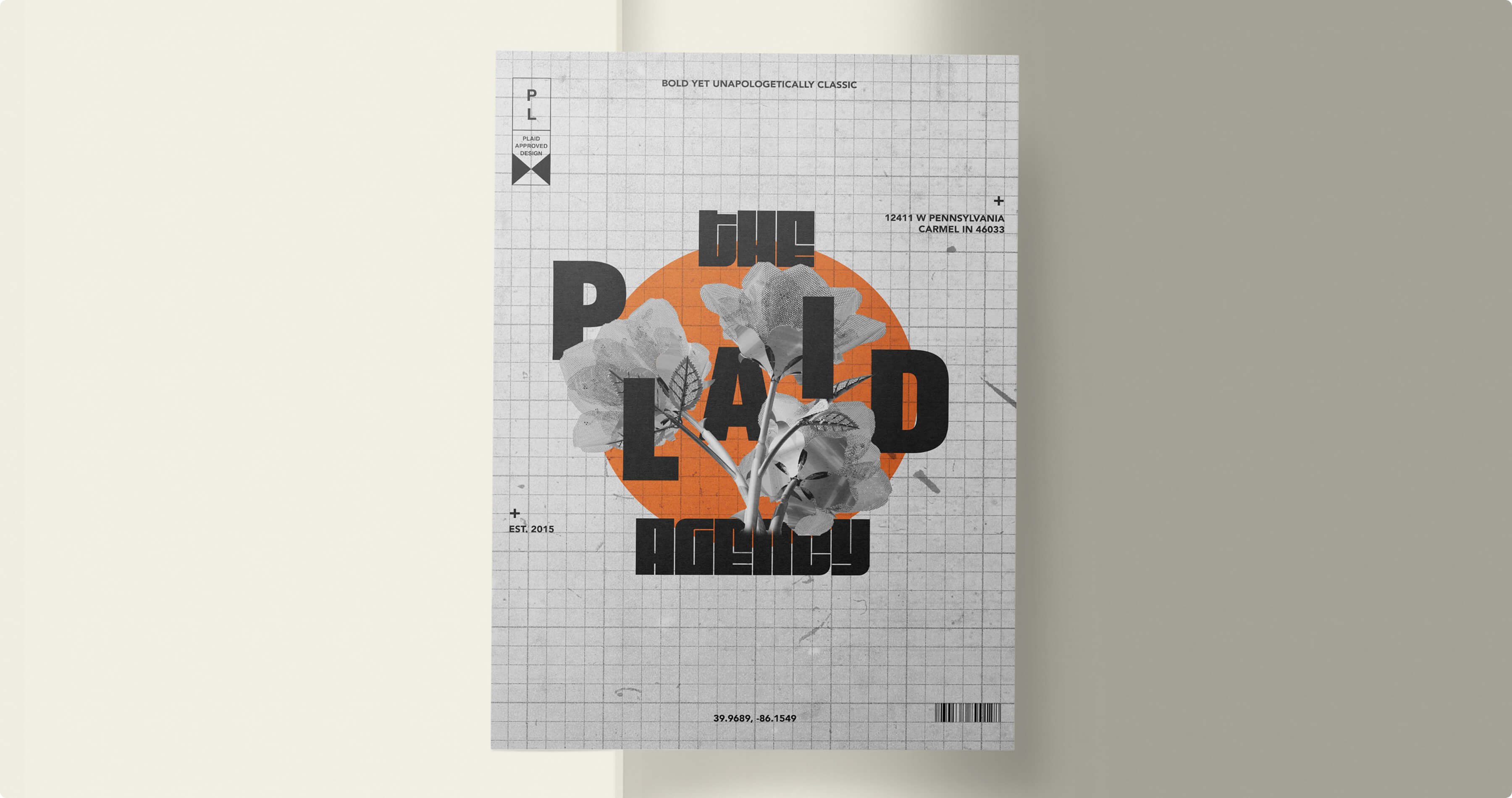
THE PLAID AGENCY
Abstract
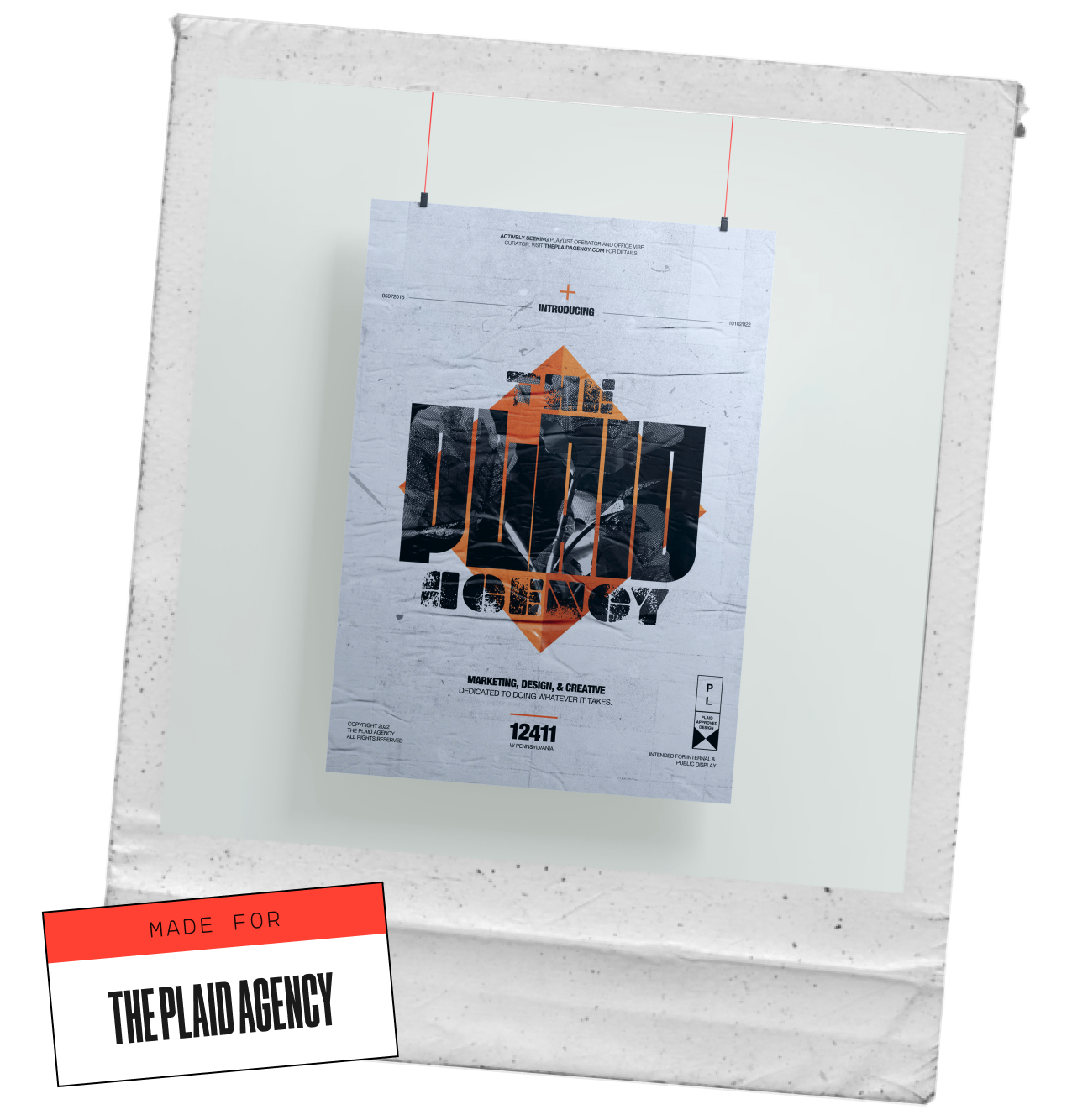
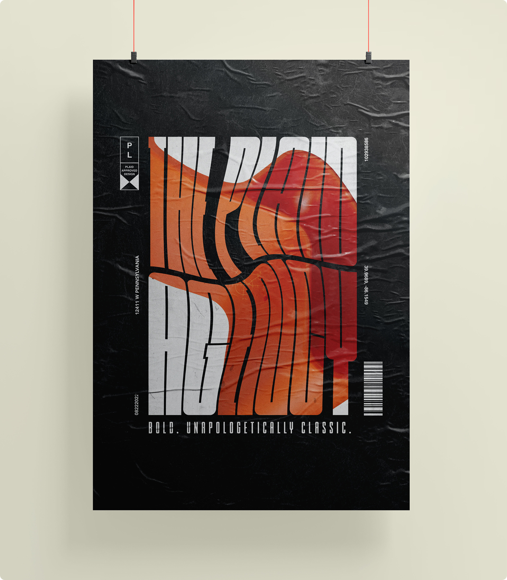
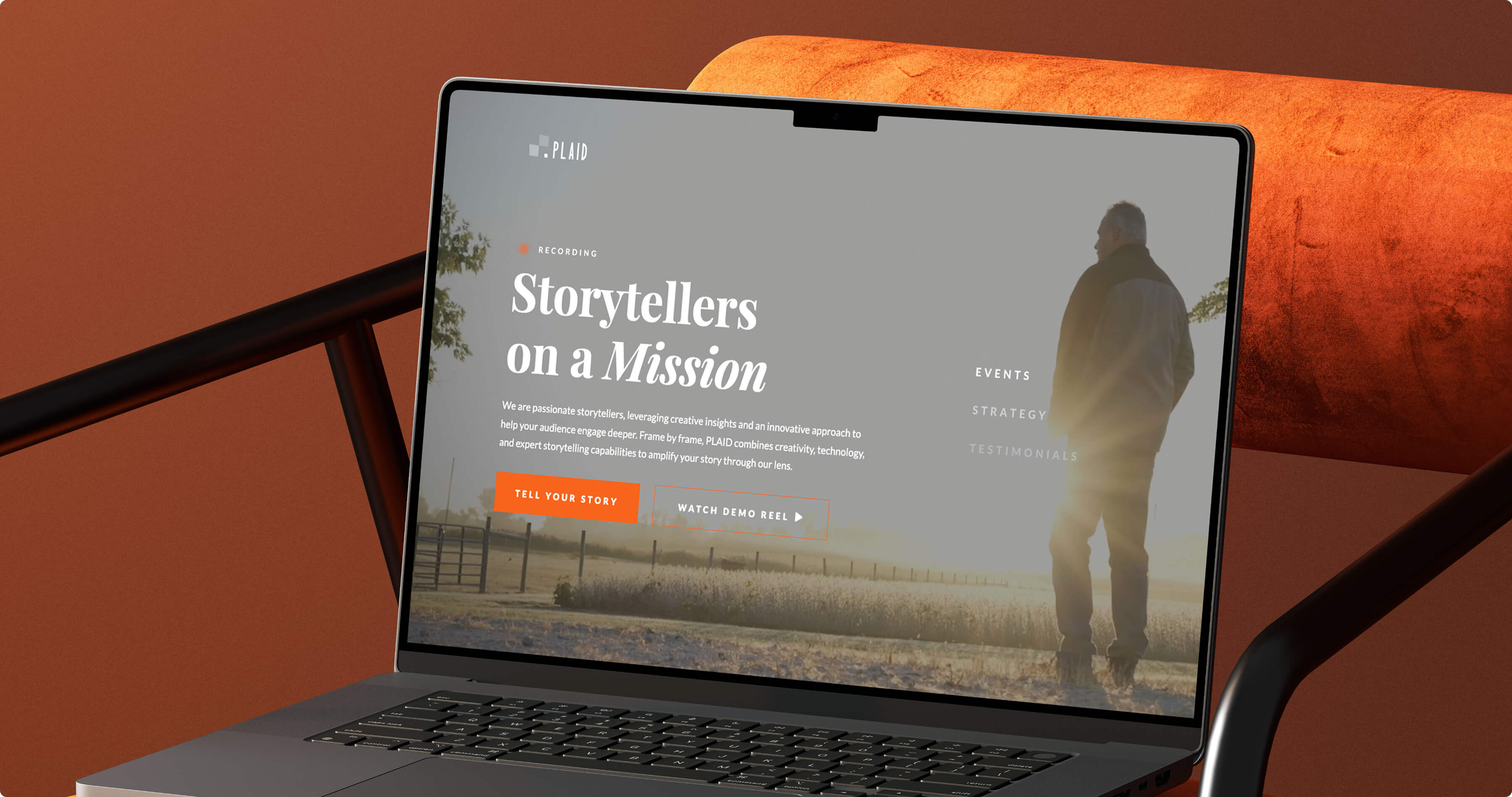
As lead designer at THE PLAID AGENCY, I spearheaded a visual refresh of our legacy brand, originally established in 2015. By introducing new textures, image compositions, and collateral designs, I repositioned the agency as a competitive, forward-thinking leader in the Indianapolis marketing and advertising space—helping secure consistent new business and reinforcing our reputation for innovation.
Brand Design
Social Media Design
The challenge
THE PLAID AGENCY had been operating with the same brand visuals since its founding, which no longer reflected the agency’s creative edge or growth in capabilities. In a competitive local market filled with modern, visually sophisticated agencies, we needed to:
- Modernize the brand’s look and feel.
- Ensure visual cohesion across public and client-facing materials.
- Maintain the essence of PLAID’s established identity while signaling progress and innovation.

research
I began by analyzing the agency’s competitive landscape, studying how other marketing firms in Indianapolis and beyond visually represented themselves. Key insights included:
- Minimalist trends in typography and layout were dominating the market, but risked feeling impersonal.
- Texture and composition could be leveraged to differentiate PLAID while preserving a sense of craft.
- Consistency across channels—from social media to proposal documents—was critical to building trust and recognition.
This research reinforced the need for a refresh that balanced approachability and authority, aligning the brand’s visuals with its strategic positioning as a creative and collaborative partner.
Strategy
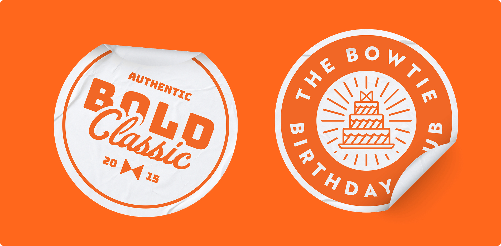
- Visual Identity Refresh – Developed a new set of brand textures, image treatments, and composition guidelines that modernized the look while staying true to the PLAID name.
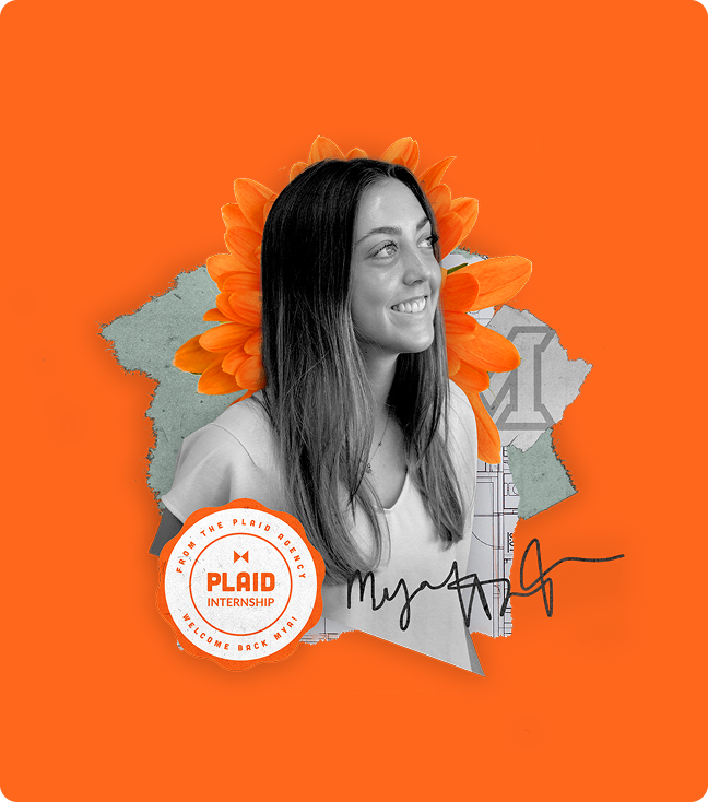
- Collateral Update – Applied the refreshed style to the agency website, social media templates, proposal decks, and other marketing materials.
- Public & Private Cohesion – Ensured the new brand system worked seamlessly across both external marketing and internal client-facing deliverables.
- Future-Proofing – Created flexible design standards to adapt the brand for future campaigns, new service offerings, and evolving media channels.
Analysis
Results
- Stronger Market Positioning – The updated visual system positioned PLAID as a creative frontrunner in the Indianapolis marketing and advertising scene.
- Consistent Business Wins – The refreshed look has supported continued client acquisition and retention by reinforcing the agency’s credibility and creativity.
- Unified Brand Experience – Visual cohesion across public and client channels strengthened recognition and brand trust.
Personal takeaways
- Brand evolution requires balance – Refreshing a legacy identity means respecting its history while pushing its design language forward.
- Internal alignment is as critical as external appeal – A brand’s visual identity must work just as well in proposals and pitch decks as it does on social media.
- Small details drive perception – Elements like texture, composition, and image treatment can quietly elevate an entire brand’s standing.